BIXI Riders’ Behaviour Analysis

Why Bixi?
If you live in Montreal, you have definitely heard of Bixi. Established in 2009, this bike sharing company continues to be a healthy alternative to public transportation and it is, actually, a part of the urban commute system. I own a bicycle, but even I do ride a Bixi sometimes! My interest to this company as a bike rider pushed me to explore the data available online to answer a few questions.
Task
My goal was to discover some patterns in Bixi riders’ behaviour, related to their membership status and the weather conditions.
Questions Asked
- Do members or non-members drive BIXI sales?
- Who brings most revenues: members or occasional riders?
- Who goes on longer rides?
- Do member and non-member riders prefer different hours?
- Do member and non-member riders prefer different days?
- Which months do people ride most?
- How does the weather impact rides?
- What are the most popular routes chosen by members and non-members?
Data Used for Analysis
Luckily, there is a plenty of open data avialble online. So, I was not only able to get access to BIXI’s data, but also find a map of Montreal to plot riders’ routes and get historical weather data for the years of interest! You can get the data I used here:
- Bixi open data (2014-2019) with pass purchases (1 table), rides (47 tables), stations (6 tables)
- Environment Canada’s historical weather data from YUL airport collected on a daily basis (6 tables)
- City of Montreal’s spacial data: Shapefile of Montreal
What variables did I use for analysis?
I am only going to focus on the variables I actually used for the analysis:
Bixi rides (2014-2019):
- Start (start_date) and end (end_date) timestamps of the ride
- Duration in seconds (duration_sec)
- Start (start_station_code) and end (end_station_code) station codes (used as ids to merge with the stations sets)
- Membership (is_member)
Bixi stations (2014-2019):
- Station code (code)
- Station name (name)
- Latitude and longitude
Pass Purchases
- Date
- Member and Non-member pass purchases
Weather data (2014-2019)
- Date/Time
- Mean temperature (Mean Temp (C°))
- Total precipitation (Total Precip (mm))
City of Montreal’s Data (2014-2019)
- Shape file of the city of Montreal (excluding the Greater Montreal area)
Data transformation
-
Data aggregation
Rides were aggregated by date, hour, weekday, month and year. One note has to be taken: the 2019 BIXI data was incomplete as the last month of the season - November - was missing. Thus, the monthly aggregations of data were performed only for 2014-2018 years.
-
Changing scale
The duration in seconds variable was tranformed into minutes for the easiness of understanding the data.
-
Discarding observations
At the same time, the observations with rides less than 2 minutes had to be discarded. The assumption was that it would not be possible to get anywhere within that short amount of time. Thus, these were not real rides. For some reason people would take the bicycle and then put it back resulting in a registration with the duration of less than 2 minutes. The idea was inspired by a blog post by Gregoire C-M.
-
Distance calculations
In addition, the presence of the latitude and longitude of the start and end points of the route allowed for calculations of the distance in kilometers. The formula used for the calculations was taken from this source.
-
Distance imputation
If a person was departing from the same station to which they were returning, the distance would equal to zero if we only take the latitude and longitude of the station into account. However, if the person spent some time on their ride, it means that they did cover some distance. Thus, the distances of zero kilometers and with the duration of at least 2 were imputed. For that, at first the average speed from the set that doesn’t contain duration<2 and km=0 was calculated. After that the zero kilometer values were imputed by multiplying the ride duration by the average speed.
The analysis
A considerable time of the project was dedicated to data preparation for analysis as multiple files had to be imported into R-Studio and they had to be appended, merged, some values had to be aggregated and some data transformation was needed. For the simplicity purposes, I am only showing some snippets of the code that, given that the datasets are available, will make the whole project presented here completely replicable. All the sets used in this post as well as the R code presented here are available on GitHub. Feel free to go there to access the data provided and replicate the project using my data!
Loading the libraries
To replicate my analysis you will only need these three libraries: library(scales) is great for number formatting, ggplot is amazing for graphs that you will see a lot here! and rgdal is need to work with maps.
library(scales)
library(ggplot2)
library(rgdal)
Some 2019 statistics
When I began this work on the BIXI data, I was just really curious to know how popular BIXI was in the most recent year - 2019. I was sure that it was not a great year for them, given the entrance of multiple competitors into the market - JUMP by Uber with their electro-bikes and Lime with their electro-scooters. Here is some quick and inetersting facts about BIXI’s 2019 year!
Total number of rides (after discarding rides < 2 minutes)
## [1] "5,377,512"
Total distance covered in 2019 in km (imputed)
## [1] "10,774,585"
Total hours of rides in 2019 (rides < 2 minutes - discarded)
## [1] "1,249,396"
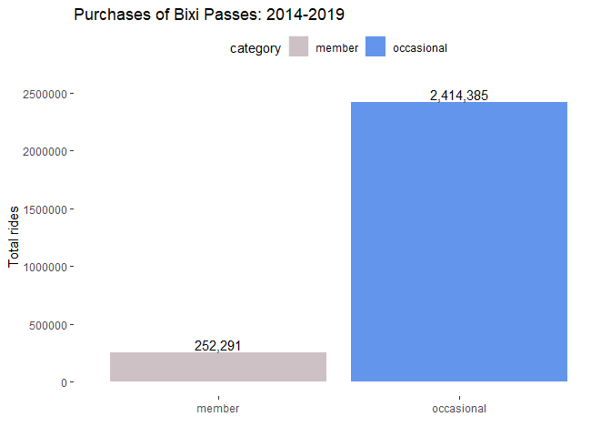
Do members or non-members drive BIXI sales?
As you will see in the graph below, most of the passes are bought by non-members. However, these passes are short-term only! Riders can use them for a 30-minute ride or for a day ride, for example. Member passes are typically annual passes and they are a way costlier than the short-term passes bought by non-members.
mem_df <- read.csv("mem_df.csv")

#plotting member and non-member purchases
ggplot(mem_df, aes(category, total, fill=category))+
  geom_bar(stat = "identity", position = 'dodge')+
  scale_fill_manual(values=c("lavenderblush3","cornflowerblue"))+
  geom_text(aes(label=comma(total)), position=position_dodge(width=0.9), vjust=-0.25)+
  ylim(0,2510000)+
  theme(legend.position="top")+
  ggtitle("Purchases of Bixi Passes: 2014-2019")+
  xlab(" ")+ylab("Total rides")+
  theme(axis.line=element_blank(),
        panel.background=element_blank(),panel.border=element_blank(),panel.grid.major=element_blank(),
        panel.grid.minor=element_blank(),plot.background=element_blank())
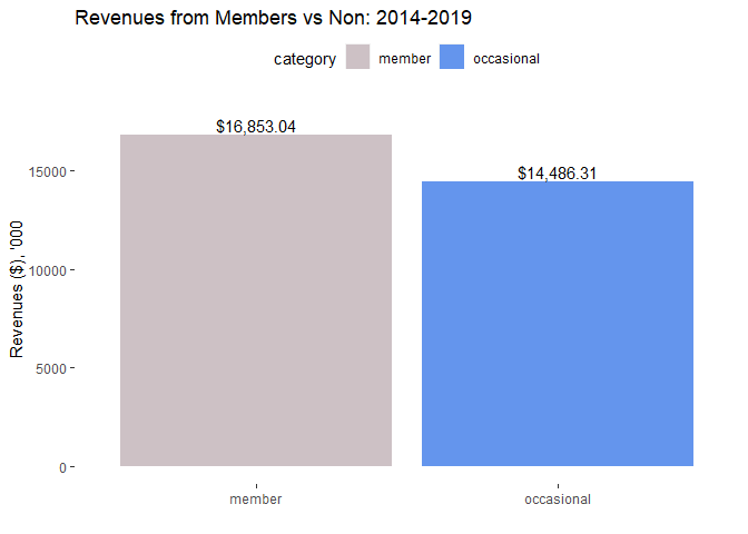
Who brings most revenues: members or occasional riders?
Even though non-members drive BIXI pass sales, greater revenues are generated by members. The reason for that lies in the fact that members pay a higher price for their passes. One-month’s pass is $36 today while an annual pass is $80! The highest that non-members pay for a pass is $6.
I did not have the actual data of BIXI revenues, so I had to estimate them. My assumption was that if you are a member, you pay either $80 (70% of users according to my estimation) or $36 dollars (30% of the members according to my estimation) for your subscription. As a result, 70% of member subscriptions were multiplied by $80 and 30% were multiplied by $36. All non-member purchases were multiplied by $6 - the highest price possible.
members_tot_rev <- read.csv("member_revenues.csv")

#plotting member vs non-member revenues
ggplot(members_tot_rev, aes(category, revenues, fill=category))+
  geom_bar(stat = "identity", position = 'dodge')+
  scale_fill_manual(values=c("lavenderblush3","cornflowerblue"))+
  ylim(0,18000)+
  geom_text(aes(label=dollar(revenues)), position=position_dodge(width=0.9), vjust=-0.25)+
  theme(legend.position="top")+
  ggtitle("Revenues from Members vs Non: 2014-2019")+
  xlab(" ")+ylab("Revenues ($), '000")+
  theme(axis.line=element_blank(),
        panel.background=element_blank(),panel.border=element_blank(),panel.grid.major=element_blank(),
        panel.grid.minor=element_blank(),plot.background=element_blank())
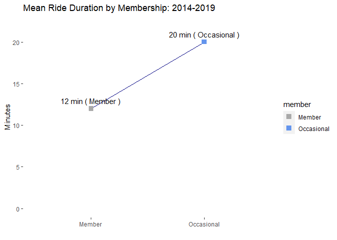
Who goes on longer rides?
Before answering this question, my assumption was that members take longer trips because being a member adds 15 minutes to you ride (45 minutes for members vs 30 for non-members). I was wrong, though. Aparently, having a pass may mean that you can easily take short trips as well since you do not have to pay for them. Non-members seem to be taking BIXIs when they need to cover longer distances. I guess that can explain the 8-minute difference in their ride durations.
mean <- read.csv("mean.csv")

# Plot member mean duration
ggplot(mean, aes(member, mean, group=1))+
  geom_line(color="navy")+
  geom_point(stat="identity",  size=3, shape=15, aes(colour=member))+
  ylim(0,22)+
  scale_colour_manual(values=c("darkgrey","cornflowerblue"))+
  geom_text(aes(label=paste(label,"(", member,")")), position=position_dodge(width=0.9), vjust=-0.8)+
  ggtitle("Mean Ride Duration by Membership: 2014-2019")+
  xlab(" ")+ylab("Minutes")+
  theme(axis.line=element_blank(),
        panel.background=element_blank(),panel.border=element_blank(),panel.grid.major=element_blank(),
        panel.grid.minor=element_blank(),plot.background=element_blank())
Do member and non-member riders prefer different hours?
From this graph we may tell that it seems non-members ride mostly in the afternoon, while members ride in the morning and in the late afternoon. It may be reflective of different goals that members and non-members pursue using BIXIs. Say, members are highly likely to use BIXIs for commuting to work or school. Non-members may be tourists or occasional riders who may use BIXIs for sightseeing or some other purposes. The graphs located further will visually show that difference.
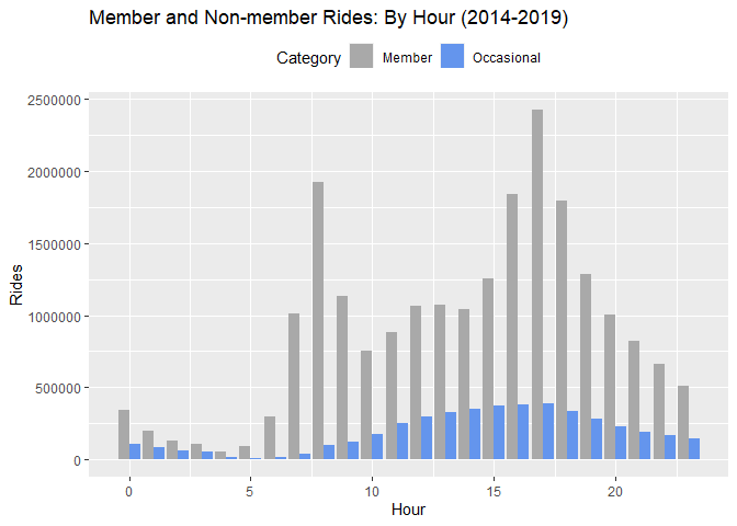
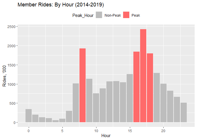
Plotting the member data only and highlighting the peak hours, we can visually see that 8 am and 4-6 pm are the peak hours for member trips. These hours magically coincide with peak hours when people commute to and from work/school.
#Plot only member rides by hours
ggplot(member_hours, aes(Hour, Rides/1000, fill=Peak_Hour))+
  geom_bar(stat="identity", position="dodge")+
  scale_fill_manual(values=c("gray74","indianred1"))+
  ggtitle("Member Rides: By Hour (2014-2019)")+
  ylab("Rides, '000")+
  theme(legend.position="top")
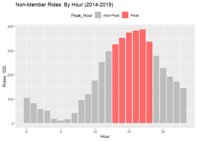
As we can see for non-members early rides are not typical. However, they happily use BIXIs from 1 to 6 pm. What it means for the company? It means that it has to make sure that its mostly loaded time is between 4-6 when member peak hours overlap with non-member peak hours. That is the time when they have to work against the clock in order to make their bikes available to those who would like to take a ride around the city.
#Plot only member rides by hours
ggplot(nonmember_hours, aes(Hour, Rides/1000, fill=Peak_Hour))+
  geom_bar(stat="identity", position="dodge")+
  scale_fill_manual(values=c("gray74","indianred1"))+
  ggtitle("Non-Member Rides: By Hour (2014-2019)")+
  ylab("Rides, '000")+
  theme(legend.position="top")
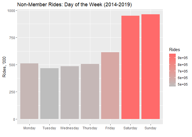
Do member and non-member riders prefer different days?
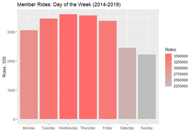
Again, to confirm the “commute theory”, we can see that members prefer using BIXIs on working days with Wednesday being the most popular day.
Non-members, on the contrary love riding BIXIs on the weekend with Sunday being the most popular day. Partially, it can be caused by their “free Sundays” propositions when on a random Sunday they make all BIXIs free. It definitely stimulates non-member rides inducing them either to try BIXIs for the first time or go on a regular ride.
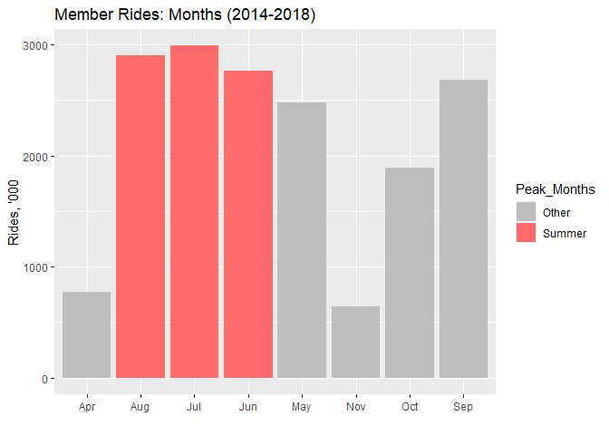
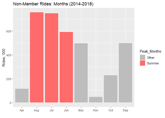
Which months do people ride most?
We can see that both members and non-members love riding in the summer months! Later this theory is confirmed by checking for correlations with the temperature and number of rides.
month <- read.csv("month1418.csv")

#Plot member month rides
month_member <- subset(month, Member==1)

ggplot(month_member, aes(x = Bixi_Months, y=Rides/1000, fill=Peak_Months)) +
  geom_bar(stat = "identity", position="dodge") +
  scale_fill_manual(values=c("gray74", "indianred1"))+
  ggtitle("Member Rides: Months (2014-2018)")+
  xlab(" ")+
  ylab("Rides, '000")
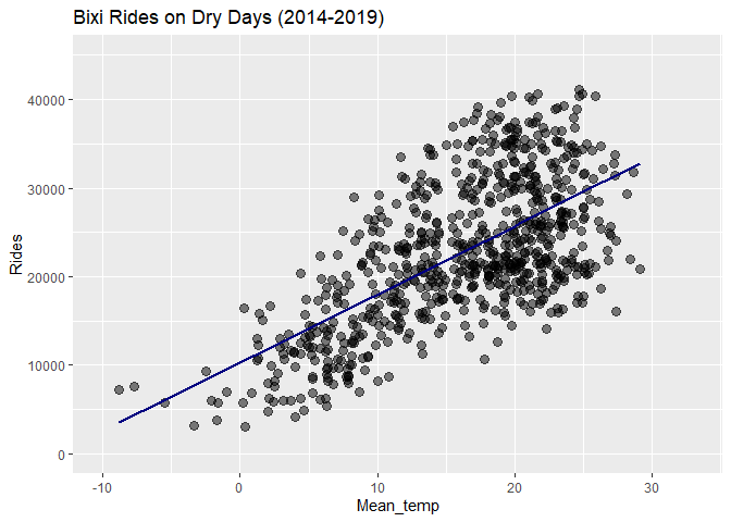
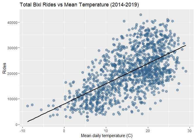
How does the weather impact rides?
How does temperature impact rides?
We can easily see that the number of rides increases are the temperature goes up. In the Appendices section, you may observe that a mild positive correlation is present between them. It can also be seen in the graph. That may mean that, perhaps, BIXI made a right decision of limiting their season to warm months only - from April up until November.
#Creating a scatter plot: Rides vs Mean Temperature
ggplot(weather_allr, aes(x=Mean_temp, y=Rides))+
  ggtitle("Total Bixi Rides vs Mean Temperature (2014-2019)")+
  xlab("Mean daily temperature (C)")+ylab("Rides")+
  geom_point(colour="steelblue4", alpha=0.5, size=3)+
  geom_smooth(method=lm, colour="black", se=FALSE)
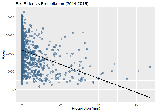
How does precipitation impact rides?
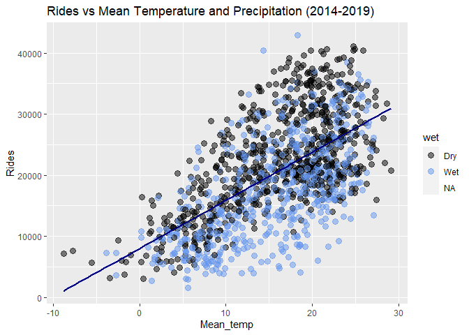
A blog post by Chris McCray on weather and bike traffic in Montreal, gave me an idea how to introduce the precipitation factor into the equation. Like him, I overlayed the scatter plot with black colour for dry days and blue colour for wet days (when precipitations are present). Suprisingly, the correlation between the number of rides and precipitation is not evident. One would think that nobody would really go riding a BIXI on a rainy day, for instance. But, those two blue outliers in the data prove otherwise. Also, in the appendices section, it can be seen that a weak negative correlation is present between BIXI rides and precipitation. Perhaps, segmenting precipitation depending on its heaviness, i.e. low level, medium and high, would provide a different result. Without it, however, we can state that precipitation does have a significant impact on the number of rides.
#Creating a scatter plot: Rides vs Mean Temperature with Dry or not days
ggplot(weather_allr, aes(x=Mean_temp,
                         y=Rides)) +
  geom_point(data = weather_allr, aes(x = Mean_temp, y = Rides,
                    color = wet),alpha=0.5, size=3) +
  scale_color_manual(values = c("Dry" = "black", "Wet" = "cornflowerblue"))+
  geom_smooth(method=lm, colour="navy", se=FALSE)+
  ggtitle("Rides vs Mean Temperature and Precipitation (2014-2019)")
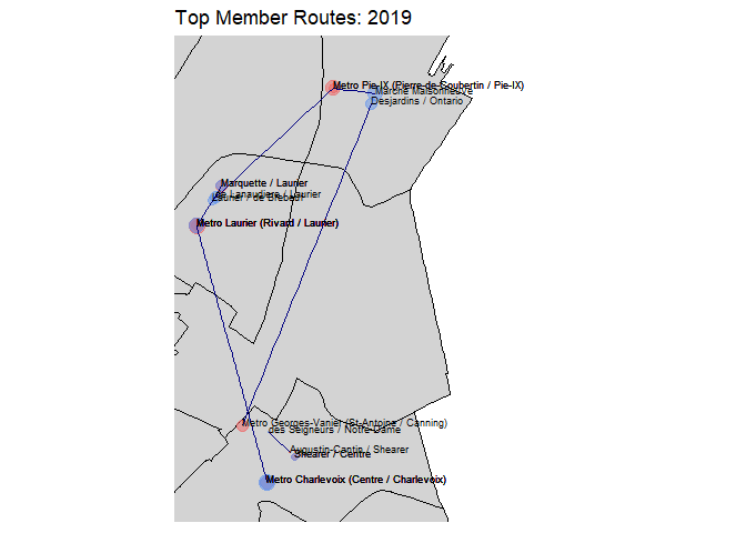
What are the most popular routes chosen by members and non-members?
By studying the map with top ten most popular routes among members, we can see that the most popular routes go through South-West, Le Plateau and Mercier-Hochelaga-Maisonneuve.
mySHP <- readOGR("LIMADMIN.shp")
dfSHP <- fortify(mySHP)
Shape files retrieved from here
members_top10_routes<- read.csv("members_top10_routes.csv")

#PLOTTING ALL POPULAR ROUTES IN MONTREAL
ggplot()+geom_polygon(data=dfSHP, aes(x=long,y=lat,
                                      group=group), color="black", fill="lightgrey")+
  geom_point(data=members_top10_routes, aes(x=long, y=lat, color=station,size=rides),
             alpha=0.5)+
  scale_color_manual(values = c("start" = "indianred2", "end" = "cornflowerblue"))+
  geom_line(data=members_top10_routes, aes(x=long, y=lat, group=group),
            color="navy")+
  labs(title = "Top Member Routes: 2019",
       x="Longitude", y="Latitude")+
  coord_map(xlim = c(-73.59, -73.49), ylim=c(45.475,45.56))+
  scale_size(range=c(.3,5), name="Rides")+
  geom_text(data=members_top10_routes,
            aes(x=long, y=lat,
                label=as.character(name),
                hjust=0, vjust=0), size=2.5)+
  theme(axis.line=element_blank(),axis.text.x=element_blank(),
        axis.text.y=element_blank(),axis.ticks=element_blank(),
        axis.title.x=element_blank(),
        axis.title.y=element_blank(),legend.position="none",
        panel.background=element_blank(),panel.border=element_blank(),panel.grid.major=element_blank(),
        panel.grid.minor=element_blank(),plot.background=element_blank())
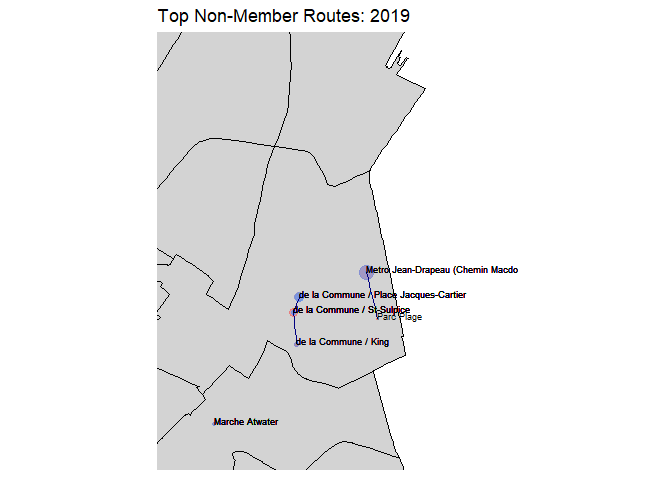
As for the non-member rides, their top ten routes are pretty short and lie mostly in the Old Port, Jean Drapeau and Atwater areas. This partially confirms the idea that BIXIs are used by tourists given that those places are common tourist destinations in Montreal.
Some extra thoughts
Of course, I did not have a complete data that BIXI has. For example, when I was calculating the most popular routes, I only took the start and end points of one ride. However, when a person rides around Montreal, their journey can include multiple stops at multiple stations. Having a user ID would have been useful to track their individual journey. However, for privacy protection, it is a good idea, of course, not to make this sensitive data public.
Also, it would be interesting to check whether adding new stations prompts more rider. In addition, I would also be curious to know how adding new stations impacts usage of the existing ones - is there any level of cannibalization and to what extent? Also, it woulld be great to check out the impact of holidays, free Sundays and other events on BIXI rides. All of that was beyond the scope of this analysis. However, would be great to undertake at some point.
Some recommendations
-
Definitely, BIXI has two separate target audiences - locals who use BIXIs to commute and Occasional riders. Thus, they should use different channels and different messages to appeal to these audiences. As we saw they mostly ride at different hours, on different days, take different routes and have different usage patterns. Thus, they should be treated differently.
-
Membership base is close to the level of saturation. It does not grow very fast; however, these riders are important for further growth of revenues. Thus, it may be a good idea for BIXI to expand to the Greater Montreal area where they are drastically underrepresented. That would definitely mean many challenges to overcome, but it would also mean that they would secure annual/ monthly pass sales to a greater customer base.
-
It can also be a good idea to make special offers during the off-peak hours, i.e. a pass at a special price in the morning for occasional riders, for example. However, this recommendation should be estimated against gained profits as sales alone may not mean an increase in profits.
Appendix
In this section I have included some extra plots that were not useful for the report analysis, but they are still important to understand how I arrived at the conclusions I made.
How are rides correlated with the temperature?
##
## 	Pearson's product-moment correlation
##
## data:  weather_allr$Mean_temp and weather_allr$Rides
## t = 28.078, df = 1272, p-value < 2.2e-16
## alternative hypothesis: true correlation is not equal to 0
## 95 percent confidence interval:
##  0.5834777 0.6513685
## sample estimates:
##       cor
## 0.6185763
How are rides correlated with the precipitation?
##
## 	Pearson's product-moment correlation
##
## data:  weather_allr$Precip and weather_allr$Rides
## t = -12.555, df = 1270, p-value < 2.2e-16
## alternative hypothesis: true correlation is not equal to 0
## 95 percent confidence interval:
##  -0.3802990 -0.2824753
## sample estimates:
##        cor
## -0.3322805
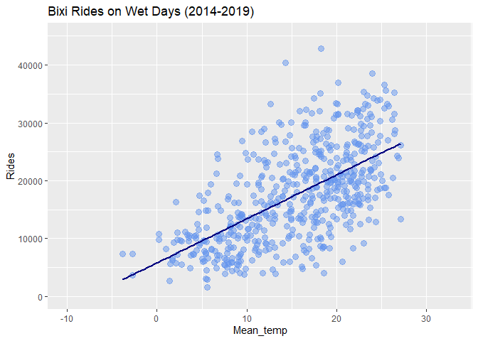
How does precipitation impact rides?
How are wet days correlated with the number of rides?
#Plotting a subset
ggplot(subset(weather_allr, wet=="Wet"), aes(x=Mean_temp,
                         y=Rides)) +
  geom_point(data = subset(weather_allr, wet=="Wet"), aes(x = Mean_temp, y = Rides,
                                      color = wet), alpha=0.5, size=3) +
  scale_color_manual(values = c("Dry" = "black", "Wet" = "cornflowerblue"))+
  geom_smooth(method=lm, colour="navy", se=FALSE)+
  ylim(0,45000)+xlim(-10,33)+
  ggtitle("Bixi Rides on Wet Days (2014-2019)")+
  theme(legend.position = "none")
How are dry days correlated with the number of rides?